What Role Does Design Play in Elections?
It’s almost November and things are starting to get tense in the States as final preparations are being made for the presidential election. This year is unlike any other election year because of the continued pandemic — many people are still at home most of the time and this means that mail-in ballots will be used in force and campaign efforts have moved from the streets into virtual spaces. In this entirely digital atmosphere, how are candidates increasing their chance of getting eyeballs and engagement? How are they making themselves memorable? Let’s take a look at how branding and identity design plays a role in elections.
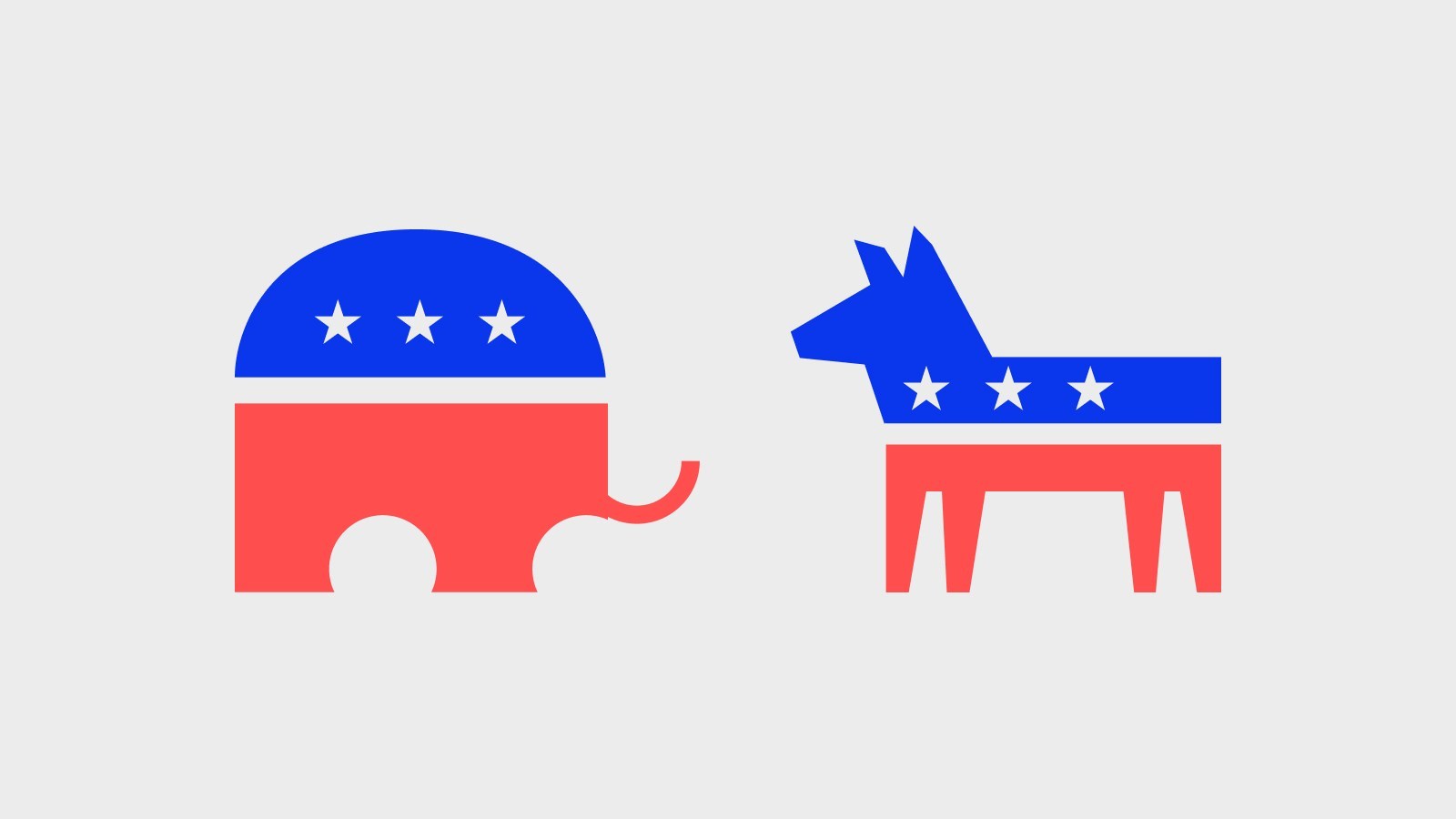
Party Identity
First, let’s consider the branding and identity of the two major political parties in the States, the Democratic Party and the Republican Party. Earlier this year, both parties released new logos and identity design for their national conventions. These logos and identities were released well in advance of the parties official announcements of their candidates, so in terms of design, their purpose was to simply and quickly convey core party values and be versatile enough to fit their eventual chosen candidates. With these requirements, the design brief becomes more complex, so let’s see how the two parties tackled this project.
The Democratic National Convention
The branding and visual identity for the 2020 Democratic National Convention in Milwaukee, Wisconsin was created by Zero in collaboration with Wide Eye. The Associate Creative Director of Wide Eye who led the design for the convention branding, Ida Woldemichael, said with regards to the design, “Because of COVID, the idea of community or being in person has changed, not just for the conventions, but for any in-person events.” Every convention location is chosen by their respective parties and changes from year to year, so often the convention branding revolves around the host city. In light of the pandemic and the virtual nature of the convention, the DNC instead chose to create a visual identity that didn’t focus on their host state of Wisconsin but on the idea of a “Convention Across America.”
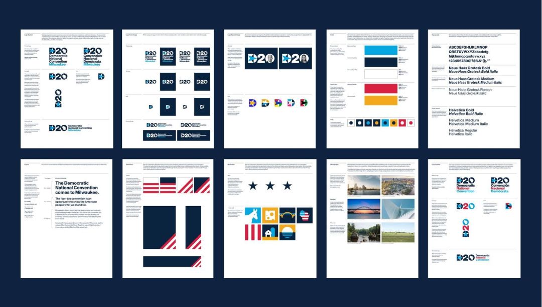
While making these changes to the design, the studios responsible considered the history of the conventions. For example, you can see the similarities between the D20 design and the design of the 1992 DNC logo, evoking nostalgia and linking to a historical narrative. A primary part of this year’s visual identity is the bold color palette, which the designers intended to symbolize the values of the Democratic Party. They chose a “classic Democratic cyan”, “traditional red, white, and blue Americana”, and a “Wisconsin Gold” to represent the Democratic Party’s willingness to carry the nation forward through difficulties while never letting go of their core values.

In terms of typography, the DNC visual identity uses the typeface Neue Haas Grotesk, which is able to help readers better focus on the meaning of what they’re reading. Compared to previous convention designs, this year’s logo is simpler and more dynamic. Zero and Wide Eye expressed their hope that simpler imagery would leave a deeper lasting impression on audiences. On top of that, this logo is easy to print on merchandise, physical products, and to apply in many other possible areas, which will cumulatively create an unshakeable image.
The Republican National Convention
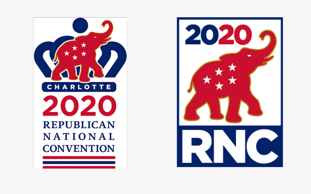
Compared to the Democratic Party which chose the nation as their core theme, the Republican Party’s design for this year’s Republican National Convention continued with tradition and revolved around the host city. Their first design of the logo had an elephant in front of a crown, the elephant being the long-lasting emblem of the Republican Party and the crown being symbolic of the host city — Charlotte, North Carolina — which is known as the “Queen City”. Wanting to avoid complying with North Carolina’s health precautions, the Republican Party moved their convention to Jacksonville, Florida and therefore removed the crown from the logo. However, even though the RNC was eventually moved back to Charlotte, the logo remained as it was after the previous round of changes.
Even though the Republican Party did not make any major visual identity changes this year, their presidential candidate Donald Trump did employ other means to grab everyone’s attention. Same as before, Trump is using “Make America Great Again” as his core message in this year’s election, yet he still managed to stir up new controversy because of a t-shirt his campaign released, now removed from their online store.
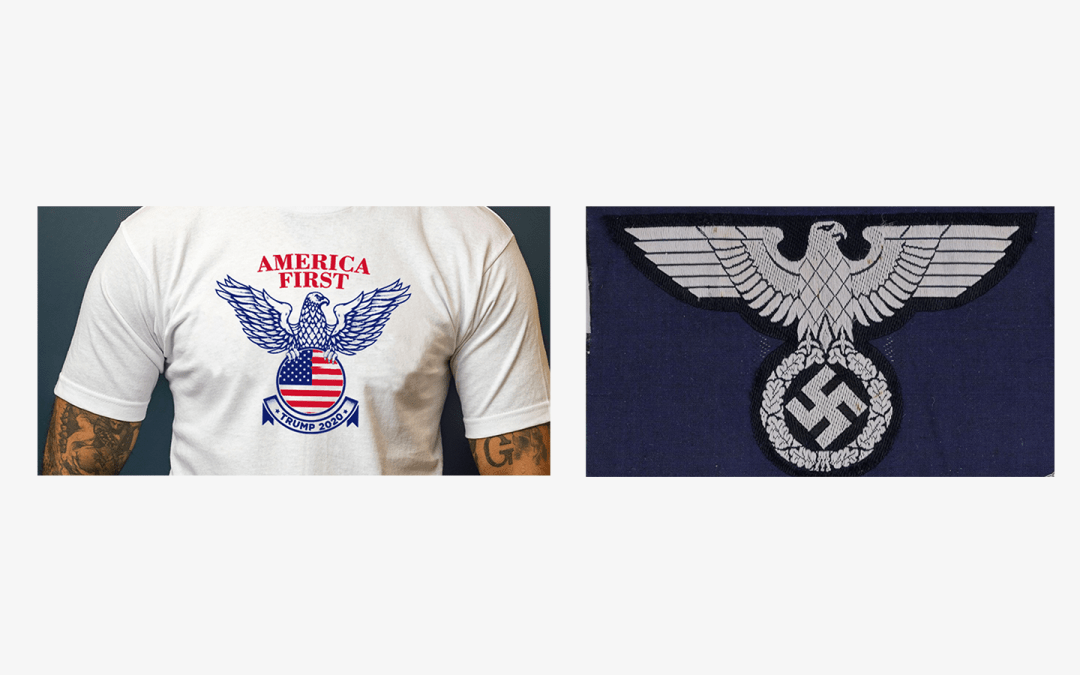
At first glance, this might appear to be an eagle representing the United States, but in the eyes of many, this immediately recalls something much more sinister. On the right is a photo of the swastika Hitler used as an emblem and by looking at these two images side by side, we can see the similarities clearly. Hitler and Nazism are obviously sensitive subjects, not to be taken lightly, so something appearing referential and in support of those beliefs is justifiably up for criticism — still, Trump’s campaign chose to release this design. Sometimes, I wonder if this was intended as a marketing ploy in bad taste. Part of the reason Trump beat out all of the other presidential candidates in 2016 was due to his ability to get the media constantly talking about him, resulting in non-stop public attention. Since taking office, his presidency has been full of instances regarding racism, social injustice, and inequality. This tee, whether a mistake or a strategy for attention, is a dog whistle and distracts from more important issues with his ideas and policies.
As a designer, this is a reminder that when designing and critiquing logos and branding, pay particular attention to symbols and iconography. It may be difficult to know the history and origin of every type of imagery and how it will be received globally, but it is important to try and see as many ways as possible an icon or logo can be interpreted. This is why I’ll usually reverse-search my completed logo designs with Google Images, as well as step away from my designs for a period of time to come back for a better gut-check.
The Purpose of Political Branding and Visual Identity Design
To a candidate, in the heat of an election, the most important thing is to be someone that electors remember and can identify with. Often, the first person that comes to people’s minds is the face they saw the most in commercials, on billboards, and on yard signs. While all of these promotional materials emphasize a candidate’s face, it’s not possible to use their image in every single application, which is why some branding and identity design is necessary. That visual identity can, at the same time, represent core values, act as symbolic shorthand, and, if unique enough, be a simple way for electors to remember candidates as well as their political positions. Having good ideas but communicating them poorly results in fewer people who understand and accept those policies. What is the most effective identity for being memorable and representing ideas that electors will be excited about?
A good visual identity system can help you stand out from the crowd. A great visual identity must present complex ideas and information in a simple understandable way, completely communicating core values without overexplaining them, making sure a viewer doesn’t get bored while retaining whatever you want to tell them. For example, think of the DNC visual identity. They used “classic Democratic cyan”, “traditional red, white, and blue Americana”, and a “Wisconsin Gold”, to simply say that the Democratic Party wants to make positive progress — hopefully strengthening the electorate approval of the Democratic Party.
There are new factors to this year’s election when it comes to considering what makes a good visual identity. Because of the continuing COVID-19 crisis, what constitutes an online community grows larger and larger to encompass all of us. The election battleground is no longer limited to physical spaces and things as more and more of it is virtual. Online, the most commonly used media are images, videos, and audio, so if a candidate sticks to using the same portraits of themselves or physical posters and billboards, people quickly lose interest. Designers must consider the applicability of the visual identities they create not only in traditional advertising formats but on major social media platforms and any peripheral advertising possibilities. This is the crux of it: simple and flexible.
In this discussion of the importance of political branding and visual identity in an election, we should take a look at the 2008 election when Obama won — the first Black president of the United States. While this is a nation that purports to have racial equality, we know all too well that the reality is far from that. Every year Black people continue to die in shootings and encounters with the police that are motivated by racism. White police continue to walk free after murdering Black people. So how on earth was it possible for Obama to win the attention and trust of the public? Why were electors willing to listen to his policies and support him at the polls?
A More Systematic and Simple Communication of Campaign Ideas
Back in 2008, online usage was more unidirectional and political parties saw campaign websites as yet another advertising billboard, not considering how they might use the Internet to engage with electors. Obama’s campaign team saw an opportunity to talk directly to the people and came up with more unique ways of marketing and publicity that involved social media and mobilizing the general public online, making Obama the first truly “online president” and leading to his victory. Obama’s campaign team dedicated their time and energy to platforms like YouTube and Twitter, among others, constantly uploaded new videos, and encouraged user generated content, all of this contributing to the voter’s feeling that they knew and were genuinely getting closer to Obama as a friend.
Additionally, with regards to messages and questions from the public, the campaign made every effort to respond in a timely manner and to exceed people’s expectations for engagement. Because of the power of the masses using the purposefully created campaign social network website My.BarackObama.com, individuals in all 50 states created more than 35,000 local organizing groups and hosted over 200,000 events. All of this meant that voters in 2008 felt like they really got to know Obama well. Also, the campaign team took full advantage of the Internet’s ability to quickly distribute information, when Obama was facing increased scrutiny and discreditation, his team would immediately get online to clarify, explain, and declare the truth, bypassing traditional media channels or having to physically hold events all over the country. While in 2008 the Obama campaign was doing fact-checking to defend themselves, fact-checking is now an established part of online behavior and media outlets, especially during elections, and is heavily relied on by voters. It is more important than ever (consider this week’s presidential debate) and America now has 52 separate fact-checking operations.
Ultimately, using the Internet and the power of the people online is how Obama won the nomination and then the presidency in 2008.
Typography and Color Show Personality
Typography and color are an important part of branding and visual identities. They might not be as memorable or attention grabbing as a logo, but they work to subtly convey ideas and values. Let’s again take a look at Obama’s 2008 campaign as a case study.
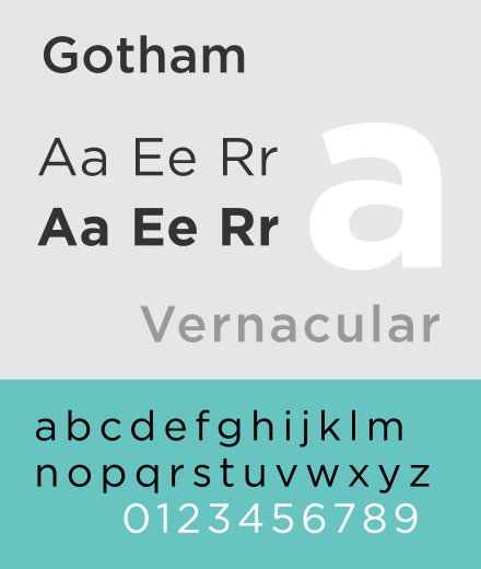
Obama’s campaign chose the typeface Gotham, a typeface that many Americans naturally associate with a sense of comfort and peace. Why might that be? Gotham is used in a significant landmark that memorializes 9/11 — the Freedom Tower. In an effort to bring people together and rally the nation, the government chose to build One World Trade Center near the site of 9/11. The cornerstone for the Freedom Tower includes these words engraved on it, “To honor and remember those who lost their lives on September 11, 2001 and as a tribute to the enduring spirit of freedom.” and these words, the cornerstone, and the skyscraper itself are symbols of freedom, justice, strength, and courage. The inscription is set in Gotham, which the New York Times called “an aesthetic signal of intent” that conveyed both a memorial feeling and optimism. While Gotham may originally have been a typeface open for individual interpretation, since the application of it on the cornerstone of the Freedom Tower, Obama’s choice of Gotham connects to that symbolism of freedom and justice. Furthermore, while Obama’s campaign used the word “CHANGE” as a slogan — a concept people might be afraid of — when anyone saw the word “CHANGE” set in Gotham, they naturally associated it with the stability of the Freedom Tower, transferring trustworthiness to the image of Obama.
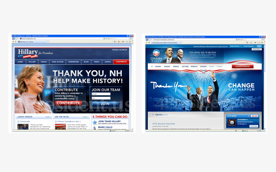
As for colors, historically, campaigns tend to choose strong and vivid colors. For example, let’s consider the website of Obama’s rival in 2008, Hillary Clinton. The color scheme is a typical navy and sharp red without much deviation, so the result is a composition without variance, a design and color palette that entirely falls within the lines of traditional American politics, which could convey stability, but is more likely to give a sense of rigidity and something stale. On the other hand, Obama’s campaign was much more forward-thinking, even though they also used navy and red, they employed the use of gradients and reflections as well as other techniques to create a website that feels more dynamic, hopeful, and of the people — exactly what Obama’s campaign was trying to say about him as a candidate, someone who will bring much needed change and hope.
The Design of Past Taiwanese Elections
I’m Taiwanese and so besides looking at the design of the American elections, I’m interested in the political branding and design seen in Taiwanese elections. Anyone who has lived in Taiwan or been there during election season is familiar with the flags and billboards that line every street, stand in each available corner, and are absolutely everywhere you look. Even if you don’t leave your house, periodically a candidate or someone on their team will come knocking on your door to give you a campaign flyer or a packet of tissue with a candidate’s face printed on it.
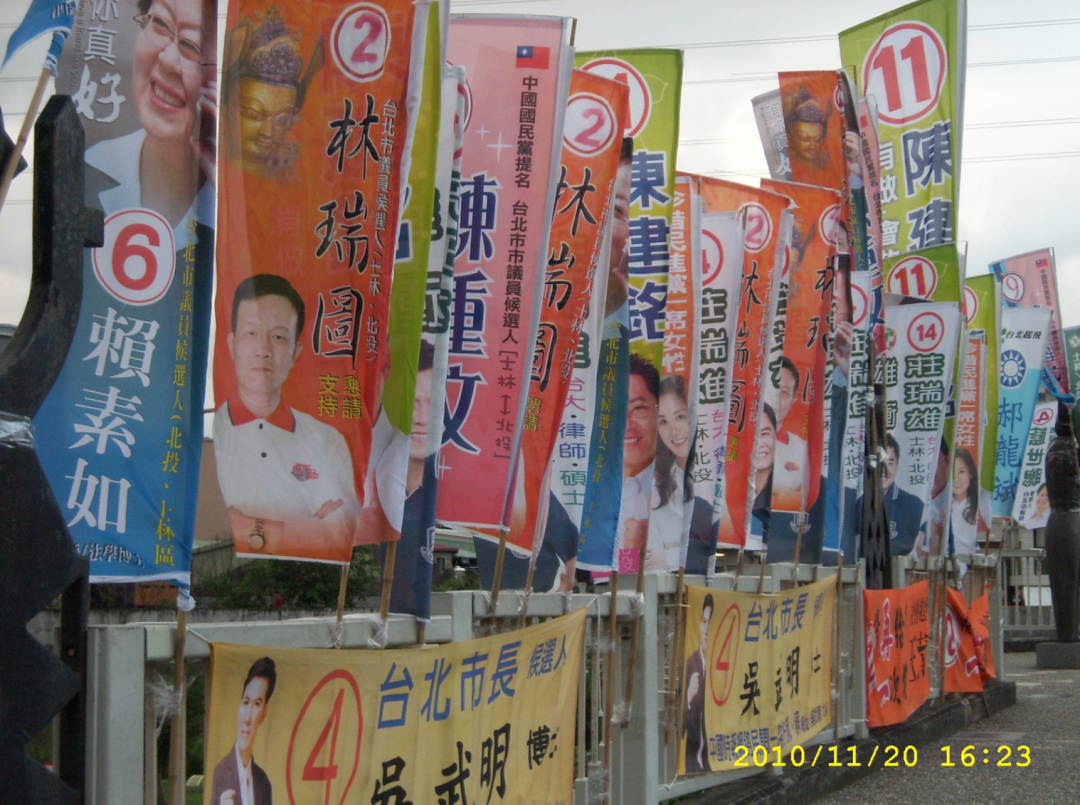
In this kind of environment, we’ve all seen some amount of political branding. In the past, up to about ten years ago in Taiwan, almost all of this political promotional material revolved around carefully photographed portraits of the candidates paired with the party colors, the party emblem, and a simple slogan — just a glance shows you what a disaster this was.
If we go back and consider the original purpose of political advertising during elections and the goals of candidates, it’s not hard to understand why campaigns make these kinds of designs. To the candidate, the main purpose of advertising is to make them memorable to a voter so that when the voter is at the polls, they have even the faintest recollection of the candidate. Using a single color background for promotional material is the simplest way to let voters instantly know if a candidate belongs to the party they support. But this kind of election strategy only uses unidirectional advertising in a traditional sense, besides creating a landscape where everyone’s identity looks the same, it is impossible for this type of design to effectively communicate a candidate’s values and ideas.
Taiwan Starts Using Political Visual Identity Systems for Elections
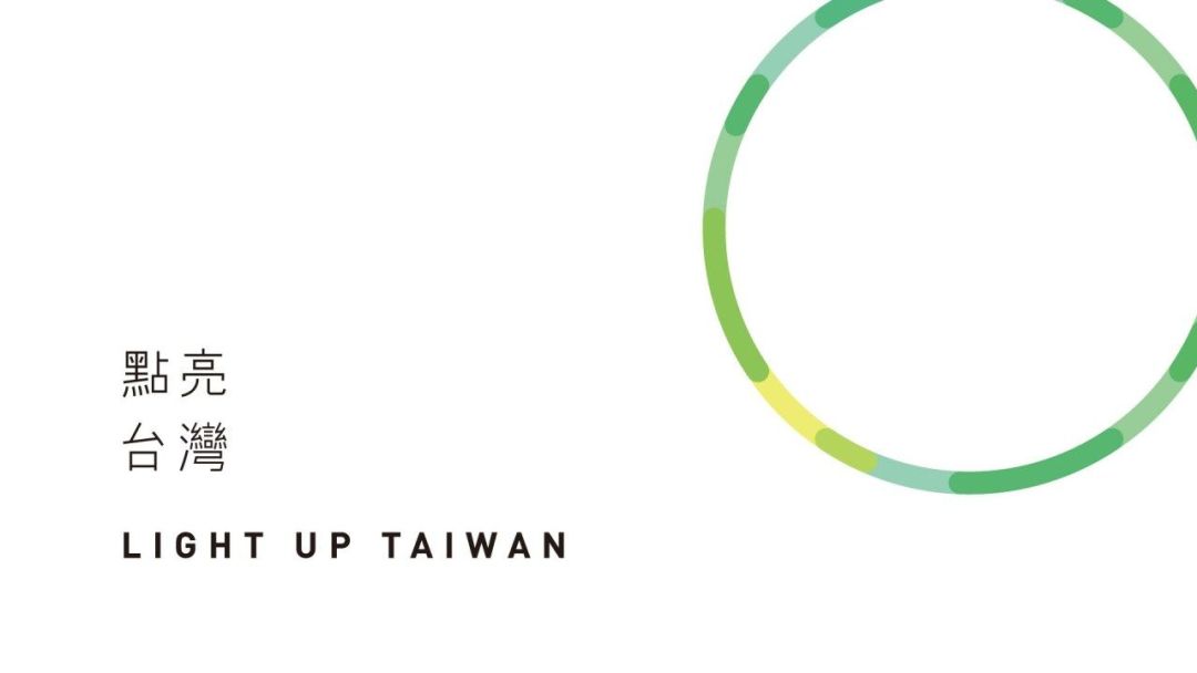
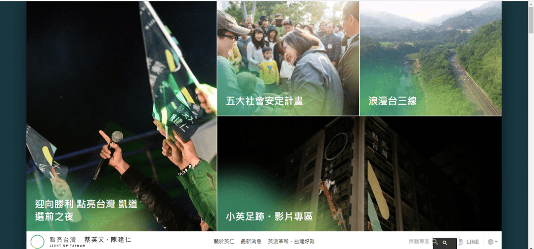
In line with how design is progressing globally, it’s not only America that’s using visual identities in elections. Today, the designs seen during Taiwan’s elections are moving away from being homogenous and repetitive to being thoughtful visual identity systems. In the 2016 presidential election, President Tsai Ing-wen’s campaign design, “Light Up Taiwan” was the first complete political branding and visual identity system we’ve seen. “Light Up Taiwan” was designed by the well-renowned Aaron Nieh. It forsakes the old political design concept of using a portrait of the candidate as the focal point and actually uses a very simple color gradient ring as the main component. A ring symbolizes the concept of light particularly well and the various green hues that make up the ring convey different meanings, with the yellow-green in the lower left-hand corner symbolizing the phrase “Light Up”. This simple visual identity, when released, received criticism for being overly abstract, but it has definitely allowed Taiwan to start breaking free from the traditional repetitive and homogenous style of election campaigns.
Throughout the campaigning process, President Tsai Ing-wen’s campaign team fully embraced the created visual identity and launched multiple marketing strategies using it, which also meant the complete usage of the typeface AR UDJingXiHei. Their application of this branding and visual identity included all physical and virtual advertising, printed material, merchandise, the campaign website — creating a consistent image throughout.
A successful campaign requires the political branding to be made with a clear vision, but of equal importance is a team or organization that carries out that vision with appropriate strategies. From this case study we can see how candidates must consider not just a single advertising point, but how they can create a holistic image using as many avenues as possible to express their ideas to voters.
Another example of an effective political branding and visual identity system is the one created in 2018 by dosomethingstudio for the Mayor of Taipei, Ko Wen-je, titled “team KP, keep it real, keep it possible”. “team KP” refers to Mayor Ko Wen-je’s nickname “Ko P”, where the “P” stands for Professor, a title that is a tradition of the National Taiwan University College of Medicine where Ko Wen-je taught. “KP” in this visual identity system also refers to the candidate’s core value of “keep it possible”. The color palette for this visual identity consists of the two colors cyan and white, with the white representing Mayor Ko Wen-je’s background in medicine and independent party position and the cyan representing a characteristic that is neither blue nor green, but something distinctly individual. Careful consideration also went into the typography for this visual identity, a selection that has sufficient character and flexibility to be used widely and effectively.
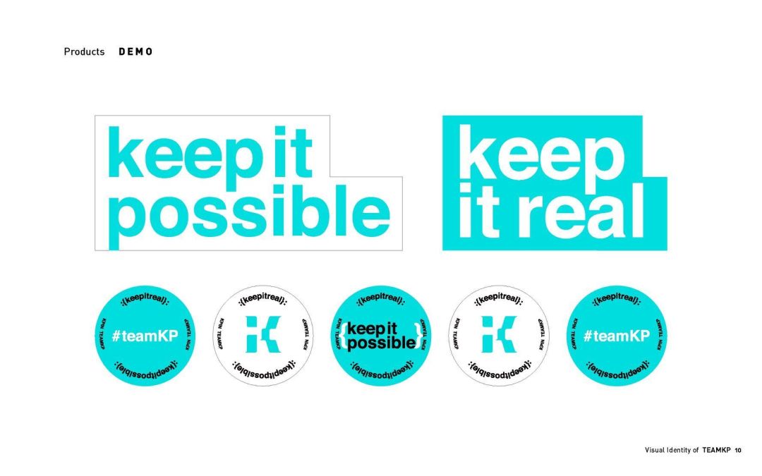
I personally think Mayor Ko Wen-je’s visual identity and usage of that system was powerful. Not only was it simple and aesthetically pleasing, but it distinguished Mayor Ko Wen-je from the crowd and highlighted his particular character and beliefs, like a slogan he used, “A wise person can’t answer a foolish question!”, and others like it, you can clearly know what kind of person Mayor Ko Wen-je is. Maybe this change in political branding and identity design for elections in Taiwan shows that candidates are no longer just thinking about exposure, but really considering how to communicate ideas and policies to the hearts and minds of the people. It’s no longer about getting the reaction, “I saw it”. This also means that Taiwanese voters are applying more independent critical thinking during elections, no longer just trusting in whatever they saw the most of.
Will Visual Identity Systems Become the Standard for Taiwanese Elections?
I think yes, because even though visual identity systems are currently mainly used by candidates in major cities such as Soo Tseng-chang, James Soong Chu-yu, and President Tsai Ing-wen, and has yet to enter every corner of Taiwanese elections, I believe the use of political branding in future Taiwanese elections is a trend. The design of visual identity systems, whether it’s for organizations or political campaigns, conveys ideas and information simply and effectively. We’re used to seeing and using branding and identity design for commercial brands and understand why it’s important to do so and what influence it can have. However, applying those same techniques and concepts to political branding for use in elections might be constrained by traditional ways of thinking and the inability of stakeholders to understand the purpose of design, therefore choosing not to use it. Still, at least there have been some forward-thinking politicians taking the lead. Of course, a candidate valuing design doesn’t mean they’ll win, but I see these shifts as evidence that society overall increasingly understands the importance of design.